
To improve collaboration between different teams and reduce code duplication, at instellix (formerly Nitrobox) we use Storybook. It ensures that UI components are consistent across the application, in terms of both styles and functionality. Let’s start by looking into what Storybook is and some of its key features.
Inhaltsverzeichnis
What is Storybook? 5 Key features
Key Feature 1: Component isolation
Key Feature 2: Live component preview
Key Feature 3: Docs & add-ons
Key Feature 4: Automated testing
Key Feature 5: Design & development collaboration
How does Storybook work?
Storybook scans the repository for any files that end with .stories.js|ts|jsx|tsx and adds the components and their stories to the collection that can be rendered in the browser. Storybook describes a story as:
A story captures the rendered state of a UI component. Developers write multiple stories per component that describe all the “interesting” states a component can support.
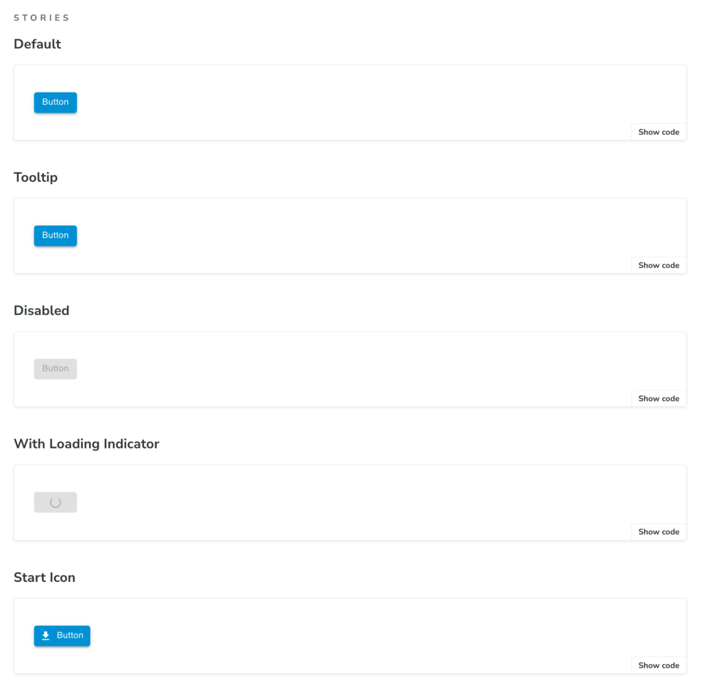
For instance, the image below shows the different stories added for one of our buttons called NbxButton.tsx. As you can see, every story also provides the relevant code snippet on the right-hand side.
Why do we use Storybook?
At instellix (formerly Nitrobox) we document our components with Storybook for multiple reasons. The first one is to improve the collabration between stakeholders from different teams in the design phase. The second reason is to enhance the visibility of components, especially the reusable ones, to developers and other stakeholders. The third reason is to test the components in isolation without having to start the entire application.
How do we use Storybook?
Nowadays many modern React applications are utilizing the Context API to provide some state that can be consumed by any UI component within the application. This state is used internally by the component to modify the styles and/or functionality of the component, which means the component can not be rendered without a certain state from a context provider.
Some of our components rely on values supplied by context providers. Attempting to render these components in isolation within Storybook will result in an error. To address this, we will begin by configuring Storybook to include the necessary context providers for these components.
Storybook configuration
Nowadays many modern React applications are utilizing the Context API to provide some state that can be consumed by any UI component within the application. This state is used internally by the component to modify the styles and/or functionality of the component, which means the component can not be rendered without a certain state from a context provider.
Some of our components rely on values supplied by context providers. Attempting to render these components in isolation within Storybook will result in an error. To address this, we will begin by configuring Storybook to include the necessary context providers for these components.
Configuring Storybook project
The first step in the configuration of Storybook is to add the main configuration file called .storybook/main.ts. The file main.ts defines the Storybook project’s behavior, like the location of the stories, which addons the project should use and so on. An example of such configuration for a React application using the Vite build tool might look like:
					import type { StorybookConfig } from '@storybook/react-vite';

const config: StorybookConfig = {
  stories: ['../src/**/*.mdx', '../src/**/*.stories.@(js|jsx|mjs|ts|tsx)'],
  addons: [
    '@storybook/addon-links',
    '@storybook/addon-essentials',
    '@storybook/addon-docs',
    'storybook-addon-remix-react-router',
  ],
  framework: {
    name: '@storybook/react-vite',
    options: {},
  },
  docs: {
    autodocs: 'tag',
  },
};

export default config;
Configuring stories rendering
The second step in the configuration process is to add the file .storybook/preview.tsx. The file preview.tsx allows us to control how stories are rendered and add global decorators and parameters. Storybook defines decorators as follows:
A decorator is a way to wrap a story in extra “rendering” functionality…When writing stories, decorators are typically used to wrap stories with extra markup or context mocking.
Context mocking is exactly what we are interested in to solve the issue of rendering components that require some state from context providers. We do this step in our preview.tsx file with the hook useContextProviders, where we mock some of our context providers that are needed to render the components independently in Storybook. The hook useContextProviders is then added to the decorators property in the preview object at the end of the following code snippet from our preview.tsx:
					import type { Preview } from '@storybook/react';
import { CssBaseline, ThemeProvider } from '@mui/material';
import React, { Suspense } from 'react';
import { I18nextProvider } from 'react-i18next';
import { withRouter } from 'storybook-addon-remix-react-router';
import { LocalizationProvider } from '@mui/x-date-pickers';
import { AdapterDateFns } from '@mui/x-date-pickers/AdapterDateFnsV3';
import theme from '../src/Theme';
import i18n from '../src/i18n/i18n';
import UserProfileContext from '../src/sharedComponents/UserProfileContext';
import { mockedUserProfile } from '../src/vitest/mocks';

const useContextProviders = (Story, context) => {
  return (
    <UserProfileContext.Provider
      value={{
        userProfile: mockedUserProfile,
        setUserProfile: () => {},
      }}
    >
      <ThemeProvider theme={theme}>
        <CssBaseline />
        <LocalizationProvider dateAdapter={AdapterDateFns}>
          <Suspense fallback={<div>loading translations...</div>}>
            <I18nextProvider i18n={i18n}>
              <Story /> // any story can consume values from context providers above
            </I18nextProvider>
          </Suspense>
        </LocalizationProvider>
      </ThemeProvider>
    </UserProfileContext.Provider>
  );
};

const preview: Preview = {
  parameters: {
    actions: { argTypesRegex: '^on[A-Z].*' },
    controls: {
      matchers: {
        color: /(background|color)$/i,
        date: /Date$/i,
      },
    },
  },
  decorators: [useContextProviders, withRouter], // global decorators
};

export default preview;
This way we ensure that the components can be rendered in isolation without worrying about the context providers.
Add component stories
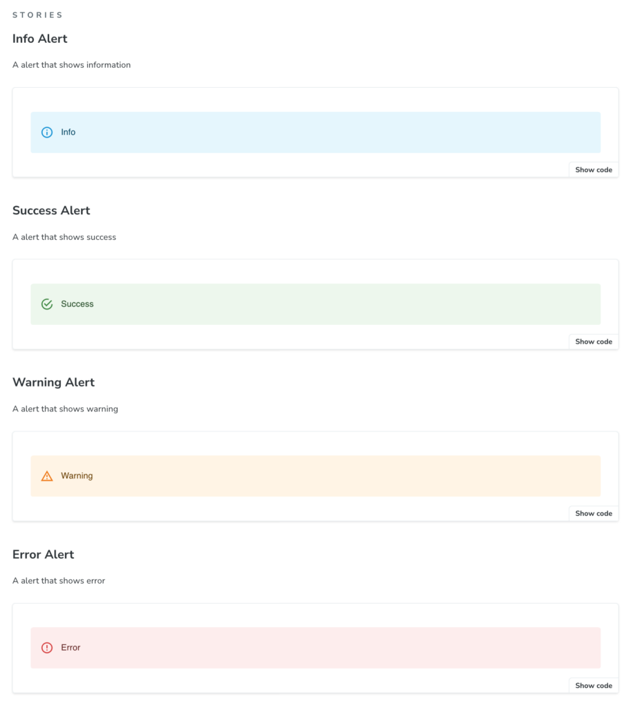
NbxAlert.tsx is used to display information with different styles inside a container. Let’s go through the process of adding its stories to Storybook.
We add the components with stories in the directory src/stories/. There we create the file NbxAlert.stories.tsx, in which we define the meta object with information about the component such as its hierarchy (defined in title, line 5 below), component to be rendered (set in component, line 6 below) and other meta information.
					import { Meta, StoryObj } from '@storybook/react';
import NbxAlert from 'components/base/NbxAlert';

const meta = {
  title: 'nbx components/Alert/NbxAlert',
  component: NbxAlert,
  parameters: {
    docs: {
      description: {
        component: `This component is a alert with various status displays. The severity of the condition is displayed.`,
      },
    },
  },
  tags: ['autodocs'],
  argTypes: {},
} satisfies Meta<typeof NbxAlert>;

export default meta;
Afterwards, we create a type Story which is based of the meta object (line 1 below). Each story, of type Story, represents one variant of the component NbxAlert.tsx, based on the values passed into args object (line 11 below). In the code snippet below, we are creating the story for a variant called InfoAlert:
					type Story = StoryObj<typeof meta>;

export const InfoAlert: Story = {
  parameters: {
    docs: {
      description: {
        story: 'A alert that shows information',
      },
    },
  },
  args: {
    children: <>Info</>,
    severity: 'info',
  },
};
With multiple stories written in the file NbxAlert.stories.tsx, a page can be created in our internal Storybook components webpage. The page for NbxAlert.tsx shows the following stories:
Conclusion
At instellix (formerly Nitrobox) we use Storybook to display and test reusable components independently, allowing for efficient development and demonstration of these components outside of the main application. Isolating available components can open up discussions about the current functionalities and how to extend them. It also helps in reducing code duplication, as reusable components gain visibility with Storybook and guide development across different teams. That is our experience with Storybook so far. Hope you enjoyed this blog, till next one!